New England Kit: Peter Saville
New England Kit
“Have you seen the back of it? It looks like a baby grow!” (Robbie Savage on Football Focus. Saturday 4th of September 2010)
Now Robbie Savage has never really been the purveyor of quality. What with his hair cuts and his lack of style on the field he cannot really criticise the great Peter Saville. Or can he? If you watched Footie Focus on Saturday you will also have heard his comments about John Toshack. By Monday John Toshack was leaving the Wales job. Maybe it isn’t just the haircut. Maybe he really should own a caravan and a crystal ball? Maybe we should be careful what we say about old Robbie.
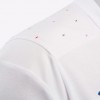
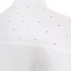
Anyway, back to the new kit. It was unveiled the previous evening at Wembley where the England team beat a very average Bulgaria 4-0. At first glance I liked it. I like the blue shorts with the white top. I like the uncluttered look that the kit has. It was not until I heard Robbies comments and looked up the design on the web that I actually realised that there were little kisses/crosses on the back of the shirt. Who is responsible for that? Well, only the great Peter Saville. A man who’s work I have been brought up with. From Joy Division to New Order I have loved his designs. The whole aesthetics of Factory Records is down to him. So, how could I not love his new kit? Well, actually I do like it. I agree a little bit with what Robbie has said but on closer examination I think it has something. If you read the explaination at Creative Review you will see that Peter Saville didn’t really get a lot of say in the whole design. The England kit is the England kit. Its white and it has a badge about here. What else is there? So the little crosses are his idea. From a distance you cannot see them so the kit looks like the usual England kit. What do they represent?
"Like a baby grow!"
“A vehicle of cultural provocation” according to Peter Saville. Let me explain. The little kisses/crosses represent the cross on the flag of St George but instead of all being red they are multi-coloured to represent our “rainbow” society. Minimal and discreet are the words used to describe the effect. Peter Savilles original design had them all over the kit. Umbro decided to just put them on the shoulders and across the back. If you apply a players name to your kit the discreetness will become invisibleness as you will hardly see them at all. There has been quite a bit of opposition to the kit and to the idea of changing the colour of the St George. I quite like it but its not really ground breaking is it? When Viv Anderson made his debut in an England Shirt someone sent him bullets in the post saying his name was on one of them. Surely 30 years later as Defoe scores a hat-trick we don’t need to be so obvious. Or do we? There are still those who hide behind the cross of St George as some sort of sign of all white Englishness. Maybe we still do need to provoke people so that we don’t become complacent of a time when black players were booed when playing for England. It’s not that long ago. I like Peter Savilles design. Maybe because I love his art work for Factory or maybe because his kit is saying something about our nation. Just don’t get me started about playing on a Friday night or Ashley Coles funny blue leg!
What do you think? Read the explaination by Peter Saville at Creative Review and let us know. [email protected] or comment below.
LINKS:
PETER SAVILLE http://en.wikipedia.org/wiki/Peter_Saville_(designer
CREATIVE REVIEW http://www.creativereview.co.uk/cr-blog/2010/september/peter-saville-interview-new-england-shirt
FACTORY http://www.factoryrecords.net/
UMBRO http://www.umbro.com/#//?locale=en_GB
By peter on September 7, 2010
Check out all the pics
Leave a comment
Back issues
- August 2018
- July 2018
- November 2016
- August 2016
- July 2016
- June 2016
- May 2016
- March 2016
- February 2016
- January 2016
- December 2015
- September 2015
- August 2015
- July 2015
- June 2015
- May 2015
- April 2015
- March 2015
- February 2015
- January 2015
- December 2014
- November 2014
- October 2014
- August 2014
- July 2014
- June 2014
- May 2014
- April 2014
- March 2014
- February 2014
- January 2014
- December 2013
- November 2013
- October 2013
- August 2013
- July 2013
- June 2013
- May 2013
- April 2013
- March 2013
- February 2013
- January 2013
- December 2012
- November 2012
- October 2012
- September 2012
- August 2012
- July 2012
- June 2012
- May 2012
- April 2012
- March 2012
- February 2012
- January 2012
- December 2011
- November 2011
- October 2011
- September 2011
- August 2011
- July 2011
- June 2011
- May 2011
- April 2011
- March 2011
- February 2011
- January 2011
- December 2010
- November 2010
- October 2010
- September 2010
- August 2010
- July 2010
- June 2010
- May 2010
- April 2010
- March 2010
- February 2010
- January 2010
- December 2009
- November 2009
- October 2009
About us
© The Northern Line 2026 | v159
An Aeroplanes design.


